A bit of a long-winded review of the Pineider Arco Blue Bee
Pineider has been a legend in stationery since 1774 supplying popes, princes and heads of state with the finest of paper and letters for correspondence and note-taking, as well as the luxury leather cases to carry such materials. In the late twenty century it moved from its prestigious shop on Palazzo della Signoria, at the very heart of central Florence to premises near the Piazza di Santa Maria Novella. In the twentieth century it also designed and sold fountain pens via original equipment manufacturing contracts with American and Italian pens makers. Rising and thence declining fortunes and distracted owners (notably luxury brand Gucci in the 1970s) saw the company losing direction in many ways, until 2017 when new investment and leadership from the Rovagnati family saved the business, sparking new life and pace into the brand and its activities. The latter included Pineider becoming a producer in its own right of pens under the inspiration of Dante del Vecchio, another more recent legend in things stationery.
Dante del Vecchio was one half of the duo driving another legendary Florentine stationery business: Visconti, and his design flare and innovative panache are now making Pineider a name to watch in pen making. Del Vecchio has a reputation as a daring innovator in materials and functionality. He is a progressive and a risk taker par excellence. (He is in his early 60s but still competes in motorcycle racing.)
Definitely a Digression I Disclaim
I have great fondness for Pineider, much due to an accidental and incidental fantastic weekend in Florence that coincided with a serendipitous chancing upon the launch of the Grande Bellezza on the 19th May 2018. Following some work on an EU project I had gotten a lift from Reggio Emilia with some colleagues traveling to Siena who dropped me off at the southern gates to the city not far from the Ponte Vecchio on a beautiful sunny Friday afternoon. My pensione (Hotel Scoti) was above the Mont Blanc shop and by another twist of fate, my daughter and friends were in the city and I had arranged to meet them the next evening.
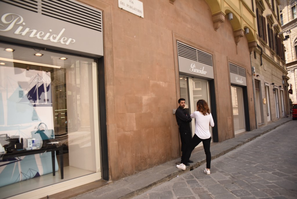
On Saturday morning I ambled through the city up past the Duomo and the Baptistry to the much renovated and partially gentrified Mercato Centrale and eventually to one of my favourite churches in Florence: La Chiesa della Santa Maria Novella. The façade, by ultimate renaissance man Leon Battista Alberti, is Pythagorean in its design inspiration and numerological calculations and one of the handful of marble church facades contemporaneous with Renaissance times (like many others the Duomo or cathedral façade was finished in the early 20th century). Inside is the most stunning, almost painfully beautiful fresco of the Crucifixion by Masaccio and in the side chapel another equally moving crucifix by Filippo Brunelleschi. In the piazza outside there was a demonstration by decent young Italians for refugees.** I lingered a while and then wandered through, taking in the scene before coming across the Pineider shop in Via del Purgatorio. (The area features in Ridley Scott’s Hannibal. Pineider has another entrance, the main one, on Piazza De’ Rucellai.) Inside I found a launch or PR event for Pineider’s La Grande Bellezza Gemstone range. The atmosphere and the staff were lovely. A kind and very gentle lady (with not a jot of sales pressure) helped me buy a La Grande Bellezza with a 14K EF nib. The material of the body, a resin and marble dust mix, gives the pen heft and shine and there is of course the distinctive quill nib. I love the pen: how it looks, feels, performs.
The rest of the weekend was equally happy, enjoyable and memorable. So perhaps I have some inherent partiality for, and implicit confirmation biases when it comes to the Pineider pens.
Invidiously Compared
Although it may seem somewhat invidious, perhaps even provocative, I have taken the liberty of comparing the Pineider Arco to a clutch of Visconti of varying vintages and nib types. In the mix are also some other Pineider models for reference, comprehensiveness. The Pineider Arco Blue Bee looks and feels beautiful. The opulence of the material is what you would expect of a Dante del Vecchio pen: stunning and unusual materials are a key design motif with his pens. Innovative material appeared in La Grande Bellezza and the Avatar. For the latter Pineider developed a new material “ultra-resin” to emulate the panache and appearance of celluloid but without the fragility; indeed, it is reputedly unbreakable. (I have not dared empirically verify this).
Thus, there is a distinct design evolution to the Arco model carrying on from other models, such as the La Grande Bellezza and the Avatar. For example, the Pineider pen clip design that features a feather, symbolic of the history of writing instruments which is also echoed in the 14k quill-nib (made by Bock) dubbed hyper-flex and with the same soft tip found in the La Grande Bellezza, and the same patented distinctive soft magnetic cap closing mechanism found in all three pens. The broad cap ring is also repeated and like the Grande Bellezza bears the company logo and the legend: “The quick brown fox jumps over the lazy dog”. There has been some comment on the latter along the lines that it perhaps a little déclassé to have such on such a pen. The big ring and the logo neither upsets, nor completely charms me. It is a useful mnemonic that font freaks will know as a way to check out how an alphabet looks and which prolific pen reviewer SBRE Brown has claimed as his innovation. Either way it is quite practical reminder about what pens are for. Would they prefer the silhouette of Florence, as per that on the Avatar?
The Pineider Arco Blue Bee

But whilst there are commonalities there are many new twists and departures. The Pineider Arco Blue Bee features an ink window, is a piston filler, plus it is limited to 888 numbered pieces. The Limited Edition cachet and price tag is a clear and present danger for pen people. But first of all, some basic details and reference points.
The pen comes in an eye-catching dark grey leatherette faux writing slope box magnetically closed with the top flap opening to reveal a Pineider ink filler with its accessory pipette, and the bottom flap opens to expose the pen on a cream faux leather bed. (There is the usual warranty and background legend of the company as well.) The pen reeks quality and looks really good. Its lustrous material looks like a complex celluloid of a lush and translucent mix of dark blue and amber yellow redolent of a high-end custom pen from the 1930s. The semi-transparent striated material reminds you of an exotic Pelikan. Pineider note the features of the Arco material come from using gold-coloured glues to join overlapping and alternate layers of resin in blue and yellow that are then cut on a lathe at a 4-degrees angle to accentuate light coming through the layers. This high-end material is carefully made and cut and then internally polished to provide small oval shaped ink windows above a black section. The distinctive quill nib with its side slits is a rhodium plated 14 carat gold and in this review model a medium of the ultra-wet Pelikan type.

The Pineider Arco cuts a familiar size and shape. At 143.4mm it’s a few millimetres longer than the usual Lamy Al-star yardstick (139mm) and slightly heavier at 31grams overall and 16g uncapped and in the hand. So, it is a fairly light weight model compared to the similar looking La Grande Bellezza. The table below summarises its key dimensions against some Pineiders and Visconti models.
| Pen | Length (mm) | Width (mm) | Weight (g) | Uncapped (g) |
| Pineider Arco – Blue Bee LE (M) | 142.4 | 12.7 | 31 | 16 |
| Pineider La Grande Bellezza (EF) | 139.74 | 12.90 | 38.6 | 23.35 |
| Pineider Avatar UR 2019 (F) | 147 | 13 | 30.70 | 20 |
| Lamy Al-Star (the yardstick!) | 139 | 15 | 21.70 | 12.20 |
| Visconti Homo Sapiens silver Pd 23k F | 145 | 13.8 | 45.29 | 26.68 |
| Visconti Opera Master Silver Dust LE (Steel F) | 151.46 | 14.69 | 37.89 | 20.35 |
| Visconti Voyager Midnight Gold 18k F | 144 | 14.20 | 33.56 | 22.69 |
| Visconti Florentia “Casa della Stilografica” 1994 LE (14k M) | 140 | 13.60 | 25.83 | 16.59 |
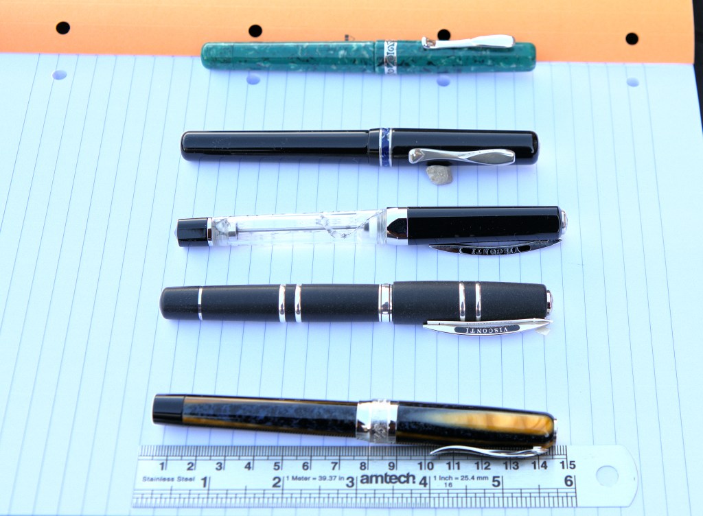
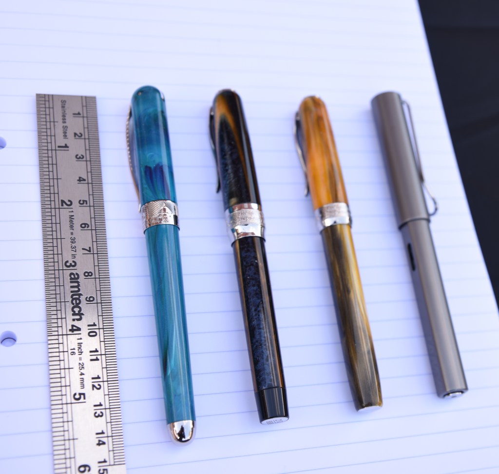
Starting at the top of the image: the Visconti Florentia, the Visconti Voyager, Visconti Opera Master Silver Dust LE (Steel F), Visconti HS, and the Pineider Arco.
The pen’s 16 grams seat snug and gracefully in the hand. It feels good to write with and the beautifully ornate 14k gold quill nib (a medium) laid down a very wet line of ink across the page.
The Arco has a series of little portholes or ink windows around the barrel just above the grip section so that you can see there is ink in the pen. It has a great ink capacity (1.4 ml) by virtue of being a piston filler. The piston filler feels solid and functional but does not seem to be at the level of the brass internals of the Pelikan Souverain M800s and M1000s, or the titanium rod in the Visconti Homo Sapiens. The body finishes with a chrome finial cap sporting the logo and the number of the pen. On the top of the cap there is the Pineider logo. The pen clip is the familiar feather shaped which has a good strong spring to it. The cap has a magnetic catch that matches up with a magnet in the body with a snug soft but solid clunk as it turns and orients the same way each time.
The distinctive quill nib works very well and powered by some Taccia Hokusai-koiai ink, a dark blue (or dark indigo as some say it) ink which is not overly wet, positively gushed from this pen’s nib. The nib has a small degree of flex that does not really translate into any significant flexing and opening of the nib tines to yield thicker line widths, or much in the way of line variation to show of the dark indigo ink’s shading. I wrote a letter with it on Clairefontaine 90gsm vellum paper and it was quite a wet romp on the paper but fortunately the ink did dry reasonably quickly. In the last line of the writing sample in the picture below you can see the ink glistening on the page. Generally I found the nib quite special and benefiting from some time to get the right angle to suit your hand’s movement across the paper.

So, what to make of this pen? Is it a new grail pen, do I hanker and long for it? Yes, I do actually like and want this pen very much and would even more so in a fine; oh, make that an extra fine. Will I be adding to the grail pen list? Well, that is not really my style and I can wait, will wait my chance to buy one and hopefully at a lot less than the Recommended Retail Price of £800.***
On the Pineider on-line site it retails at €767. Cult Pens sell it at £680 (and that is with discount). There are many USA pen vendors discounting it at sub $500 prices (£353) and one “de-stocking” in May 2021 had two at $350 (but they sold out very quickly). Many might want to buy at that price point and will feel themselves very lucky if they get it.
So, is it value for money, worth the money? I find that difficult to pronounce on for anyone other than myself. Are other ‘Limited Edition’ and luxury pen items worth their asking price? Possibly not. The usual test is: what will market take it/buy it at? As with the Guccis of this world there is the element of building the brand to the point where the punters will accept price premiums because it is an expensive luxury grand.
In all honesty there would probably be intervening choices at that price point which would take my interest and payment which do not include Gucci-type pens. (Well maybe a few of the Visconti, I admit.) Notwithstanding, a current limited wherewithal, I think that it is a very well-made pen with stunning material and hitting the premium point properties that a top-drawer, limited edition pen should hit. It is very definitely a landmark pen in Pineider’s evolution. In short, it has registered and primed my acquisitive reflex.
Conclusions
The Pineider Arco Blue Bee is a beautiful well-designed, high-quality pen: the materials are stunning, it’s a piston filler with an ink window, it looks and feel good in the hand, light and very comfortable and finally it is a numbered, limited edition pen. But it will, and certainly has, divided opinion in the United Inkdom reviewers’ group.
Thus, it is definitely not a pen for everyone; indeed, it is clear that it has not garnered the grail pen status that many Visconti models have. Its’ price tag and point will tend to see pen folk divert to other intervening choice points and pen models, which in many ways will reflect the confirmation biases of current pen tastes.
So, whilst it may currently be something of a window-shopping model where I am not in a position to weigh it against other choices, it is very definitely an object of yearning which I will come back to. I certainly like the pen and what it has to offer. It is clearly another major development point in Pineider’s evolution in pen making. Perhaps it is not a Masaccio masterpiece but it strikes many of the chords echoed in the craft of Leon Battista Alberti: a successful integration of technical themes and design harmonies to produce something exceptional that you will want to return to. Pineider with Dante del Vecchio leading their pen business are undoubtedly one to watch. More so than the other one in Florence, I think, which may seem somewhat heretical. I would definitely welcome a Pineider Arco Blue Bee in my collection and in my hand and in preference to other luxury pen brands such as the one below Hotel Scoti. But there lies another tale.
ENDNOTES
* This is a somewhat overwrought (and overwritten) allusion to the fantastic book of Stephen Greenblatt: The Swerve: How the World Became Modern, describes how the bibliophile Poggio Bracciolini, a 15th century scribe and secretary having lost his job when his boss the Anti-pope John XXIII lost his, went book hunting in the monasteries of northern Europe. It has a very strong handwriting link. Bracciolini had the most beautiful script of his day and his drafting skills brought him to working with a series of popes after the debacle of his employer at Council of Constance. Bracciolini rescued what was supposedly the last copy of a monk scribed copy of the Epicurean Lucretius’s De rerum natura (On the Nature of Things) and the rest is our history. Does the allusion hold, or is this metaphor just another ‘linguistic trap’ for me?
**Opponents of the appalling Matteo Salvini and thus the type of folk that Dante de Vecchio would thoroughly empathise with.
***All prices taken in May 2021.
DISCLAIMER: the usual disclaimer applies: this pen was loaned for review without prejudice or pressure for a positive view of the pen. It is part of the United Inkdom series of independent pen reviews driven by the genuine interests and pen pleasure seeking outlooks of an unusual but I think really nice bunch of people. 🙂

Excellent review- and by the way, I loved The Swerve. For an acdemic, he writes well.
LikeLiked by 1 person
It was a great book. I have his volume: Tyrant, but not yet started it. So much to read and think. Which is a very good thing I think. Thanks for reading and your kind comment.
LikeLike