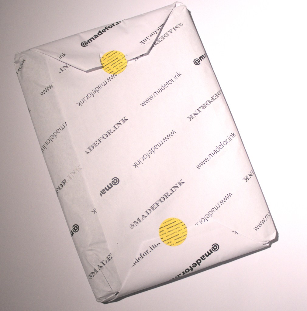
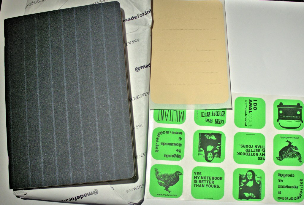
Reviewed here are two very different but beautiful new notebooks from Rob de la Porte. Each boasts excellent quality paper, but which have slight texture and paper weight differences which ultimately do matter. The notebooks came beautifully packaged increasing expectations of something of good and of quality therein and I was not disappointed.
Robert de la Porte provided a set of four B5 notebooks styled as Exorcise books and a set of three A5 sheets very chic Chalk Stripe notebooks. As often happens with souls such as pen and ink enthusiasts you get drawn into the task and explore ever deeper. Indeed, Rob’s munificence and a certain sense of responsibility made me plunge in. Here follows some thoughts and explorations which I hope do justice to Rob’s productions.
A Bit of History
But first a quick dive into something that we all have an inkling about but perhaps needs an explanation of sorts. We owe paper sizing regimes to a longstanding effort to rationalise what we use to scribe our thoughts in and gather up the stuff that brings us information and knowledge. Notebooks have been, and I would argue remain, fundamental to our organisation of thoughts and the scraps of knowledge we gather in our wanderings through books, places and encounters with others. That acquisition of knowledge and reason depended on writing and paper, close reading, annotating, often scribing in the margins and then (hopefully) producing new distillations to stimulate and occasionally intoxicate. Notebooks and scrapbooks have been subject to organising for many hundreds of years. Medieval and Renaissance scribes were often systematic indexers and bullet-pointers of their commonplaces.
On size and systematisation, a seminal influence was the 18th century German philosopher and physicist Georg Christoph Lichtenberg, whose experimental activities were studiously recorded in his “scrapbooks”. Lichtenberg’s “scrapbooks” followed the medieval and Renaissance traditions of commonplace books or waste books where scribes recorded the stuff they saw and learned. His scrapbooks were each given a letter of the alphabet from A, which began in 1765 through the letter L and his death in 1799.
It was he who proposed the idea that paper sizes should follow an aspect rule where the length to width ratio remains fixed across different sizes. The starting point of a square metre of paper that is A0 size where two sheets can be reduced to fit on exactly one sheet without any cut-off or margins. Thus, the A0 base size is defined as having an area of 1 m2; given an aspect ratio of √2, and actual dimensions of 841mm x 1,189mm. Fold over this sheet in half to get A1 at 594mm × 841mm and so on down to the popular A5 size (148mm x 210mm) of the Chalk Stripe notebooks.
With the B series the aspect ratio is maintained but the area differs and the area of B series sheets is the geometric mean of successive A series sheets. B0 starts at 1,000mm × 1,414mm through to B5 at 176mm × 250mm, which is a popular size for notebooks and printed books, such as for example, Anthony Grafton’s: “Inky Fingers: The Making of Books in Early Modern Europe” which records the interactions between scribes’ commonplaces their writing, proof reading and book productions. The B7 of 88mm × 125mm is another equally familiar yardstick and measure of many of our lives: passport size. The notebooks reviewed here are in B5 and A5 formats.
The Exorcise Notebooks
These card-covered notebooks have 30 pages of 100 grams per square metre (gsm) bright white smooth finished paper with 7mm spaced boxed lines (blue), 7mm lined (red), plain (orange), 5mm dot squares (buff coloured). The 30 pages are held together by three heavy duty staples. The front cover is as plain and austere as a school exercise book with a 75mm by 50mm text box on it to record your name, a subject topic and date and perhaps a letter or number like Georg Christoph Lichtenberg’s scrapbooks.
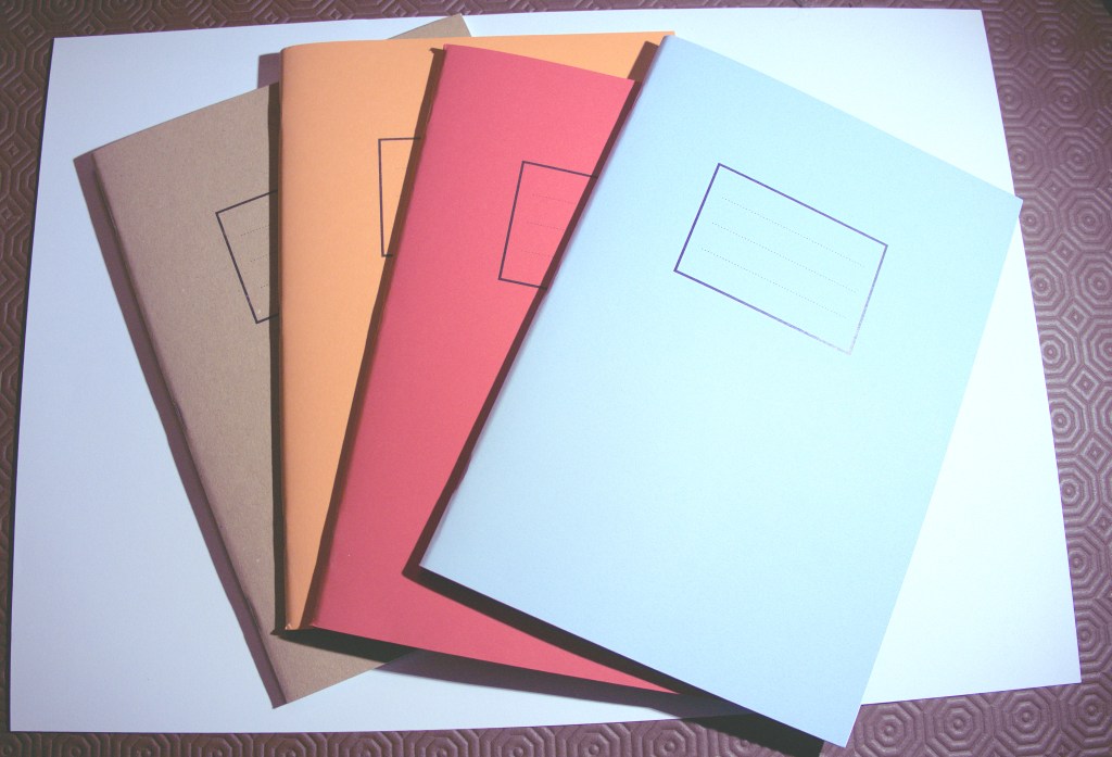
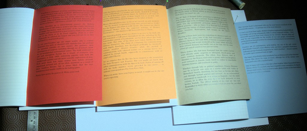
The inside covers back and front distinguish the notebooks, which have a theme of witchcraft; to exorcise it rather than celebrate its persecution. The research of the images and text were carried out by Fountain Pen UK’s Scribble Monboddo, pen and ink enthusiast and historian and they really add to the notebooks. The light blue one features reproductions of woodcuts of the infamous torturer and murderer of wise women: Matthew Hopkins. Each inside cover ends with a wise axiom. In blue:
“Always read widely; there is room to make plenty of notes in this book before you have to write a conclusion.”
In the red Exorcise book the inside cover features the 15th century malodorous Malleus Maleficarum, a manual for torturing witches. It advises:
“Stories have power, for good or ill. Write your story well.”
The orange features the strange Elizabethan Doctor Dee, eruditely sweeping through the even stranger HP Lovecraft, the mad bad Aleister Crowley, Joseph Smith of Mormon fame, and 007!. The adage suggests:
“When you write, have your legacy in mind; it might not be the one you’re expecting.”
Finally, the inside buff coloured front cover has a reproduction of a book made by the 11th Duke of Rutland in 1619 recording the lamentable putting to death of two women for witchcraft on 11th March 1618. In the fraught times of the war between the new religion (Protestantism) and the old religions (Catholicism and even older folk beliefs) women were the constant losers and victims. The victimisation, torture and execution of Joan Flowers’ (who herself died before they could murder her) daughters: Margaret and Philippa are excellently recounted by Scribble Monboddo’s scholarly text. He notes that there is a unique ecclesiastical monument to this incidence of witchcraft in Bottesford church, but no marker to, or even records of the trial of the poor women tortured and publicly murdered. The pithy motto of his final sentence is a worthy axiom and orientation for filling these notebooks:
“Remember to write what you see and what you hope for, not what you fear.”
It is an edict that Lichtenberg, a scourge of pseudo-science and mountebank quackery, would heartly approve.
The paper in the Exorcise notebooks is an absolute pleasure to write with and equal to taming a wide range of ink types and ink dispensers. I teamed the wet and wonderful combination of a Pelikan M1000 (18k gold EF nib) with Pilot Iroshizuku Kon peki and as I wrote, could see the surface tension of the deep cerulean blue ink bead surrender to the paper’s embrace.
I tried the paper with a variety of different pen-ink combinations: a Sailor Naginata Togi equipped with Robert Oster Opal Mauve, Noodler’s 54th Massachusetts in a Hong Dian Blue and a Manuscript Dodec 2B, a Waterman Carene 18k gold Fine nib filled with Rohrer and Klinger Verdegris, a John Garnham JG6 with a titanium fine nib and powered with Diamine Inkvent Midnight Hour. All of these, including the very wet JG6 permutation, were quickly absorbed by the paper. I also tried out a Lamy Al-Star filled with the dye-pigment based Diamine Tealbreaker ink. It looked great on the paper and quickly soaked in.
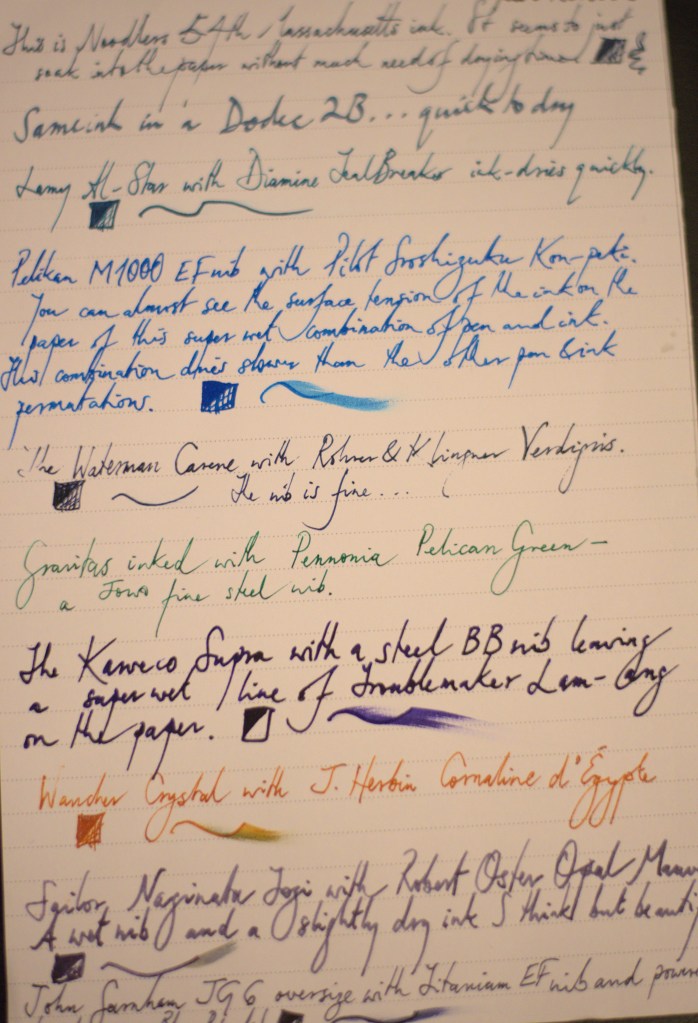
The paper behaved perfectly: no feathering, no bleed or show through, and the inks seemed to show very true to their colours and characteristics. I particularly liked the look of the super saturated purple blue of the Troublemaker Lam-ang and the subtle shading of the Robert Oster Opal Mauve. Neither the blitz of the former, nor the subtly of the latter were missed out on this paper.
Under a 30x loupe the inks looked very similar in terms of line and surface definition, give or take the shading tendencies of each. I wondered how the ink and the paper would look under the higher magnification of a microscope? More on that later.
The next step was to compare and contrast the paper weight and quality to something in the same weight. I took out a sheet of A3 Canon 100gsm and with the trusty bone folder folded it to A5 so that the grain was in the same direction (this is how I was taught in bookbinding classes). All the ink-pen combinations worked quite well on this “bog standard” generic yardstick comparator, although the super wet Pelikan M1000 Kon-peki combination showed clear signs of feathering on the Canon 100gsm paper. Interestingly, the sheen and shade properties of the Diamine Midnight Hour showed up better on the Canon 100gsm paper as if the uneven spread of the ink has an almost chromatographic effect.
In summary: the Exorcise notebooks are excellent quality, performing very well and consistently with any pen and ink combination and particularly with super-wet pen and ink combinations. Their consistent, smooth performance and ability to tame ink might upset some folk who are eager to show off or exaggerate some of their inks’ properties, such as sheening and shading but I recommend them to anyone who wants to see an accurate performance of an ink on paper.
The Chalk Stripe Notebooks
These 240gsm card covered notebooks consist of 120 gsm off-white smooth uncoated paper with 5mm squared (dotted not continuously lines), plain and dot lined (7mm). These are beautifully designed and reek of care and thought inside and out. The dot square notebook has an aqua fly and cover lining, the plain: a fawn fly and lining, and the lined a beautiful warm orange shade fly (described as old gold). The paper is certainly heavier than those of the Exorcise notebooks. There is a sticky label with each notebook to record your name, a subject topic and date and perhaps a letter or number like Georg Christoph Lichtenberg’s scrapbooks. Lichtenberg would definitely have loved to use these notebooks as he ventured around his fine university city of Göttingen or worked in his laboratory. So do I, and so do ink and pens.
I tried 12 ink and pen combinations with this notebook. These ranged from a Kaweco Supra with a BB steel nib fuelled by Trouble Maker Lam Ang which wrote wet but without any signs of feathering or bleeding through, next a Lamy Al-Star using the dye and pigment Tealbreaker ink, a Pelikan M1000 filled with Pilot Iroshizuku Kon-peki, a Wancher Crystal with fine steel nib inked with J Herbin Cornaline d’Egypte, and a JG6 with Diamine Inkvent Midnight Hour. As the photograph shows the paper handled them all very well, without any sign of inconsistency or artifice. Again, the Pelikan delivered Kon-peki was probably the slowest to dry, and the double broad nib with the wet Lam-Ang also dried slowly. The shimmer of the Cornaline d’Egypte showed and the Diamine Midnight Hour’s sheen was also revealed more than on the slightly lighter Exorcise notebook’s paper.

The paper was a real pleasure to use with a very wide range of ink and pens. It seemed made for writing with, the sort of stuff that makes you want to write but also scribe something more than just the humdrum; poetry perhaps? Or maybe record your explorations with a microscope?
At this point I thought that the delving deep should go a bit further so I geeked out and bought several microscopes (yes, another rabbit hole for sure) to get closer to the paper and the artefact of ink on its surface. The main tool was an ex-laboratory instrument well-specified with 40, 100, 400, 1000 magnification and with condenser (a Vickers M15 model to be precise). The usual hands-on and web-based learning followed and examined the two notebooks’ papers against Clairefontaine Triomphe 90 gsm brushed vellum and 68 gsm Tomoe River. The latter perhaps perversely as it is anathema to Rob de la Porte, but a beautiful photo-microscopic image of mulberry paper fibres on a Nikon website prompted this; plus, I have some of the paper.
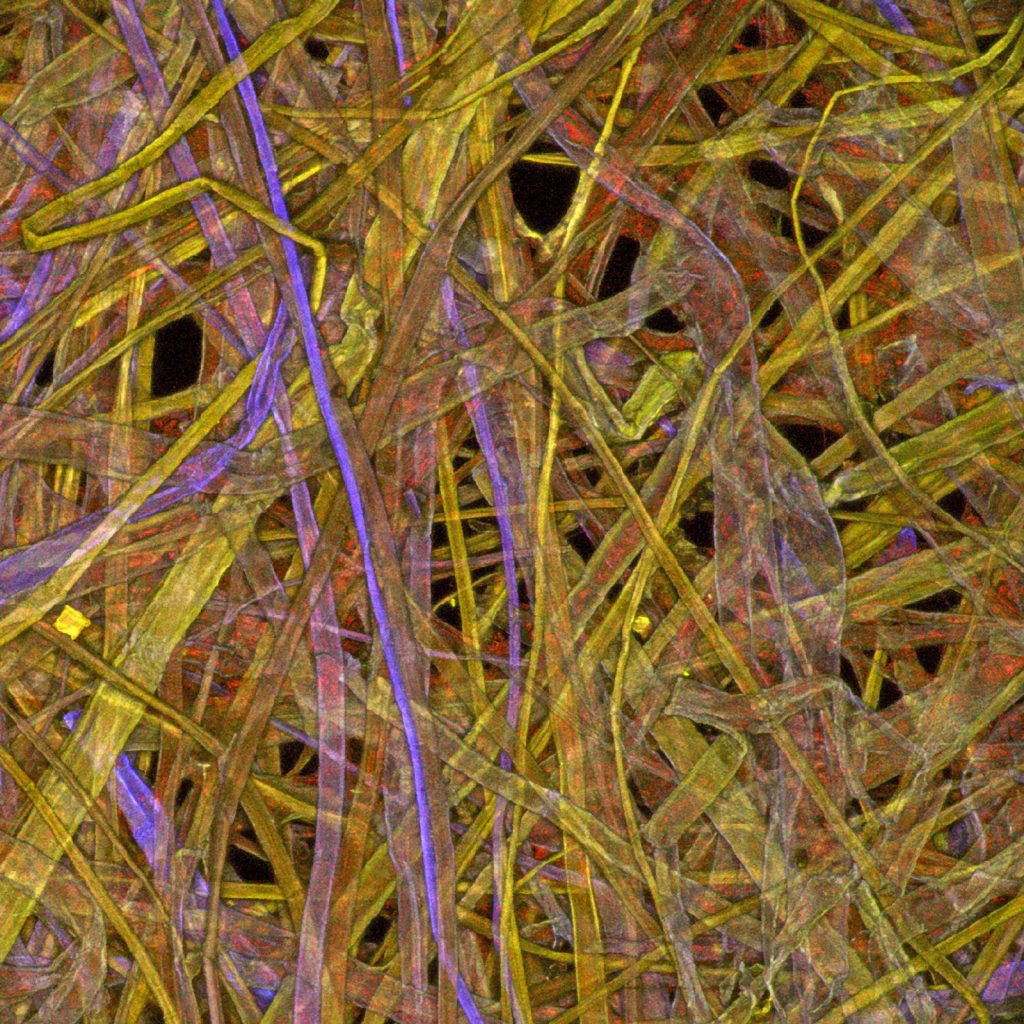
* [Paper fibres (mulberry), Charles J. Kazilek, Arizona State University, School of Life Sciences. Kazilek’s image at 100X magnification used the confocal technique, where a laser light source and a dichromatic mirror are part of a process, including raster scanning and sophisticated computer techniques, to eliminate the out-of-focus flare effects that you can get with typical microscopy light sources.]
Kazilecks’s artistic and sophisticated image follows in the footsteps of an older microscopy explorations. Indeed, the microscopic investigation of paper is a century-old phenomenon and something of a legion in the form of R. E. Lofton’s 1922 classic: “Photomicrography of Paper Fibers” (Technologic Papers for the Bureau of Standards, Volume 16, pp 629-650). His methodology and his photomicrographs of different paper weights (figures 26, 27 and 28 in his article) are still immediate, look modern and certainly seem relevant.
Initially I thought to share my somewhat crude photomicrographs of the modern papers compared and contrasted. The methods used echoed Lofton’s and my rudimentary scientific approach was to keep the pen and ink constant, chiefly a Pelikan M1000 EF 18k gold nib using Pilot Iroshizuku Kon-peki ink, with the variable element, the different papers. The photomicrography was a bricolage effort with a full-frame digital SLR via a T2 adaptor down one of the eyepiece tubes (not advisable practice) and then some minimal editing. My budget, kit and my know-how did not extend to sophisticated confocal techniques with lasers and computer rendering so I sought out some expert advice and assistance from award-winning microscopist: Mike Smith, the secretary of the Leeds Microscopical Society. Mike’s thirty plus years’ experience and fantastic kit are in a different league: researcher skill and top-quality laboratory standard equipment, which yielded a series of images that clearly showed the superior quality of the Exorcise and Chalk Stripe paper.


The deep blue is the Kon-peki ink and the black dots in the foreground are one of the printed dot grids on the paper.
Some Speculative Semi-Scientific Hypothetical Rambling
What you see is ultimately what you get; perhaps? The explorations at microscopic level were intrinsically interesting in that they made you think about what was going on in the interactions between the ink and the paper? What you see through a microscope is an artefact of transmitted light or reflected light if using other techniques. Indeed, it is just a lot more magnified than the same phenomenon you see with your own eyes of the ink on the paper. However, a magnified scrutiny does helps you see what is going on with the ink in greater detail.
In brief, the two heavier papers from the Made for Ink notebooks seem to absorb more of the ink in the fibres, and their interstices, across the path traced on the paper and in a more consistent manner. The trace of the nib and ink on the 90 and 68 gsm papers seems to sit on top of the fibres of the paper even when the ink is saturated or contains pigment as well as dye. But even if the paper is the variable are we comparing like for like? Is there a coating on the Clairefontaine and Tomoe River papers that tempers this? Mike Smith’s images from a reflective light source (a cone of light down onto the ink on the paper) show the same effects on the different papers and tend to confirm that it is not some artefact of the transmitted light’s path through the paper. The different microscopy techniques show the Made for Ink paper in both notebooks as taking up more of the ink, more evenly and consistently.
Recommendations and conclusions:
The Exorcise and Chalk Stripe notebooks are very definitely top quality. They are made with paper you can trust; indeed, rely on to handle any pen and ink combination consistently. They are handmade by an ethical UK-based producer and they are excellent value for money. A lot of care and attention, thought and probably love, has gone into these two, very different notebooks and it shows. They feel good to look at, hold and write in.
I particularly liked writing on both these papers. Seeing the ink surrender to the paper, and look good on it, is the ultimate test. These really are ‘must have’ notebooks. I especially like the Chalk Stripe notebook’s paper. These are definitely the scrapbooks for me. I would gladly dig into it to write poetry and, develop hypotheses of paper and ink that my inky fingers could explore and scribe with evidence gleaned from reading widely and gathered up from other sources.
I highly recommend the Exorcise and Chalk Stripe notebooks. I am ordering some this weekend.
Where to get them and such stuff
The B5 Exorcise notebooks retail for £6.95, and the Chalk Stripe A5 notebooks for £7.95. These notebooks can be ordered direct from: https://madefor.ink/
For those who want to read widely…
Ann Blair (2011) Too Much to Know: Managing Scholarly Information before the Modern Age, Yale University Press, Princeton
Anthony Grafton (2020) Inky Fingers: the Making of Modern Books in Early Modern Europe, Belknap Press, Harvard, MA
